
Friday, 28 January 2011
Sort of final draft for image 1 for the Searle Award.
Almost finished with this stage! I really need to get into the swing of these images over the weekend, then full scans, coloured and done! I'm an optimist, what can I say?
Tuesday, 25 January 2011
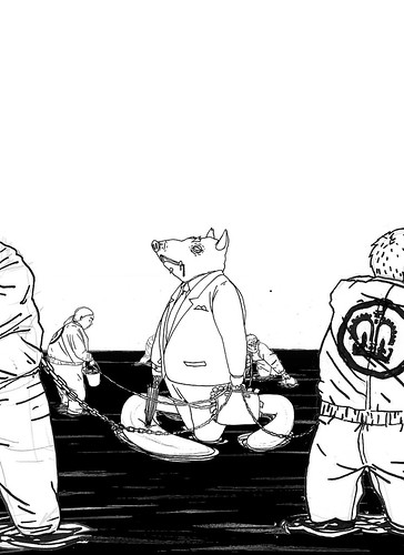
Searle Award 'Crisis' First Image preliminaries and gubbins
Working in my typically piecemeal 'my head works in Photoshop layers' way, these are some early stuff for my potential Searle Award entry on the theme 'Crisis'. I'd post some thumbnails, but it's rare anyone can understand them apart from me, like a hideously drawn secret code. None of the stuff I'm posting here is even a complete draft, as I'm working on a final component for the draft of image one. The crisis theme I chose is the recent (and potentially ongoing) financial crisis and recession. Without the central component, this is not in any way obvious, so these are most definitely just process. Basically, it's all very rough, so no judging please!


The first and second are identical apart from the left foreground figure, and I'm still adding/removing him and tweaking things

Then there's the background of the second (or third) piece of the five

They're all pen and ink, comped in Photoshop, and the waves are a simple block colour with two versions of the inked parts recoloured and offset.
Inadequate planning
Sometimes when left to my own devices I fail to plan properly, and leap into finalised or semi-finalised images, and this, of course, leads to work that is nowhere near as good as it should be. Case in point, my first draft for entering the Searle Award (an award specific to Cambridge School of Art students, started and in honour of Ronald Searle, the epic illustrator and creator of St. Trinians)
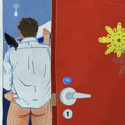
So, here it is. It doesn't get the point across, the descriptive parts of the image are too small, and just about the only half-decent bit is the composition, although my use of diagonals is a little heavy-handed. I've since scrapped this, and I'm taking elements on to my new version of this, which I'll post process work for soon. Also, thanks to advice from my tutor, it may well be a series of 5. Scary, but not due until March.

So, here it is. It doesn't get the point across, the descriptive parts of the image are too small, and just about the only half-decent bit is the composition, although my use of diagonals is a little heavy-handed. I've since scrapped this, and I'm taking elements on to my new version of this, which I'll post process work for soon. Also, thanks to advice from my tutor, it may well be a series of 5. Scary, but not due until March.

Sunday, 9 January 2011
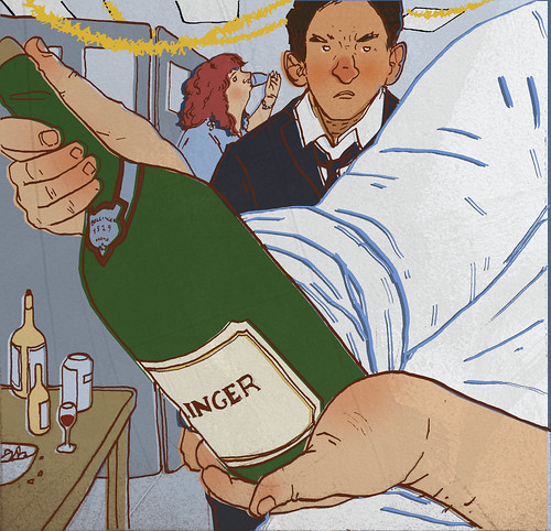
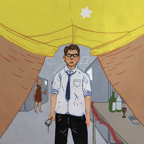
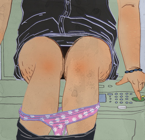
Christmas brief - what not to do at the office Christmas Party.
Can't say I enjoyed this one, as I couldn't find ways to interpret the article differently. Also, I had a hell of a time with the storeroom image, as something wasn't working but I couldn't work out anything better. I think tiredness was a factor on that one! I'm pretty glad this one is over, but I used it as an excuse to alter the techniques I was using and try out some new stuff.
Don't order Champagne when everyone else is drinking cheap wine
Dress to impress, not to shock - think twice about those gold hot-pants
Stay one drink behind your superiors at all times - it's only OK to pass out if the boss does first
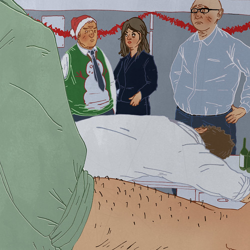
You may be drunk, but don't sleep with a colleague
Under no circumstances should you be using the photocopier, especially to do this:
Don't order Champagne when everyone else is drinking cheap wine
Dress to impress, not to shock - think twice about those gold hot-pants
Stay one drink behind your superiors at all times - it's only OK to pass out if the boss does first
You may be drunk, but don't sleep with a colleague
Under no circumstances should you be using the photocopier, especially to do this:
Sunday, 2 January 2011
Sickness vs. Creativity.
By god I wish I'd got this done before Christmas as planned. Out of the five images the brief asks for, I have one complete so far, and only two others beyond the thumbnail stage. Not the most inspiring brief, either, but not helped by the fact I wake up in the mornings feeling like I've repeatedly smashed my head against a wall.


The article we were given is about office Christmas party etiquette, and leaves little room in the text for any non-literal imagery. I'm much better when there's something potentially fantastical going on. Basically my ideas are all about the composition this time because the content is entirely provided, unless I'm missing something, which may be the case.
Subscribe to:
Posts (Atom)
