Ink on sawn board
Saturday, 23 January 2010
Monday, 18 January 2010
Furry things!
More lettering for the text project. I much prefer the handmade type style of things, makes life much more interesting.
Yes, I'm an awful photographer, and the setting is terrible, but really you'll just have to cope with that.
Friday, 15 January 2010
Baltic Centre for Contemporary Art quick painting
A painting of the Baltic in Newcastle for my Text in Context brief, about the use of text and how it interacts with its environment. It features my horrible habit of tilting my head (leftover from a childhood eye condition) as the cause for everything being on a slant. This happens a lot when I try to draw or paint complete scenes. It's really terribly annoying as by the time I notice it it's usually too far gone to correct without re-starting the image. Oh well.
The painting is acrylic and fine-liner detail, in a 6"x 4" sketchbook of Windsor and Newton paper
Thursday, 14 January 2010
Some truly wonderful illustrations from an old children's book I found in a pavement book sale on Holy Island (otherwise known as Lindisfarne Island) off the coast of Northumberland. The book is called 'A Book for a Nook', and has no date in it, but was gifted to a girl called Anne in 1942 by someone named Graham.
The illustrations appear to be by a Ruth Cobb, (Or Ruth Kupferman, as Google would have it), who is unfortunately no longer alive, but seems to have had quite a successful career, though she is hard to find on the internet.
Labels:
book,
children's,
childrens,
cobb,
cubby,
ephemera,
illustration,
kupferman,
ruth
Wednesday, 13 January 2010
Leftover forgotten upload
This is a part of a page from the screen-printed and hand-bound book I did for the Print & Process module last term. The remainder of the book is still in for marking, but more will go up when I get it back. This page was only a two colour, but the book ranged from one to three depending on the page spread. The brown is a higher percentage of mixed emulsion (both white and clear) than technically needed, but it created a slightly faded effect that I was looking for.
Friday, 8 January 2010
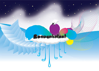
Text as image brief - 'Somnambulant' concept
Basically, the brief is to alter words so they look like what they mean. Sort of a visual onomatopoeia (though I am unaware of an actual word for this), and the four words I chose, and am chugging along with, albeit not well as this feels graphics-y. Essentially I am sinking into the part of myself that is something of a soulless image-making robot rather than an illustrator. Boo.
I thought 'somnambulant' would be a good word to choose, as I am a sleepwalker myself. I was wrong. It took me ages to think of things that were relevant, and when I did, they were tough to convey as letterforms, and therefore I ended up with images with vaguely altered text in them, like so:
Then there's the bits for the word 'organic' which are going a bit better:
Colour is a bit off, I'll work that out later and re-upload. That's what I have so far. Hoorah! Or not.
Subscribe to:
Comments (Atom)


